
Cat Portrait Background Ideas: Color and Contrast
Compare simple, natural and dramatic cat portrait backgrounds. See how color, contrast and framing affect fur detail and the focus on your cat.
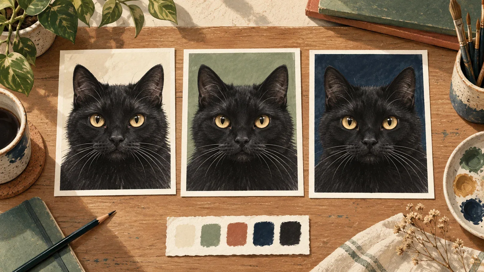
Table of Contents
A useful cat portrait background makes the face easier to read and supports the mood you want. Start with three decisions: how much contrast the coat needs, how much detail belongs behind the cat, and where you will view the finished image. A background that works on a wall may be too busy inside a small profile circle.
Choose contrast before choosing a color name
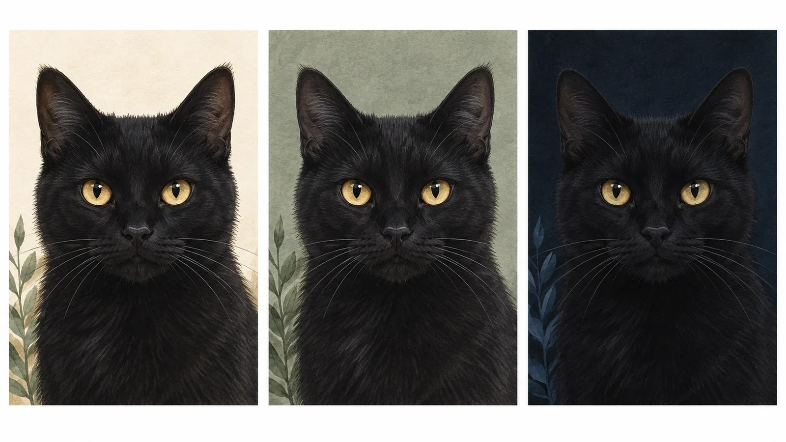
AI-generated comparison: compare the ear and cheek edges against each background. The drawings are illustrative, not a controlled photo-editing test.
Compare the edge of the cat's head with the area immediately behind it. Can you follow both ears, the cheeks and the chin? If the outline disappears, changing the background's brightness may help more than changing its hue.
| Portrait feature | Background direction to compare | What to inspect |
|---|---|---|
| Dark coat | A quieter midtone or light background | Ear edges, cheek shape and dark fur detail |
| White coat | A midtone background rather than featureless white | Whiskers and the lit side of the head |
| Warm orange or cream coat | Muted cool tones or a restrained neutral | Whether the coat remains the first thing you notice |
| Strong tabby markings | Simple areas behind the head | Whether stripes compete with background patterns |
| Formal costume | Restrained architectural or painted scenery | Whether the costume leaves enough space for the face |
These are starting points for comparison, not rules that assign colors to breeds. Lighting, crop and the actual coat pattern can change the result.
Compare four background approaches
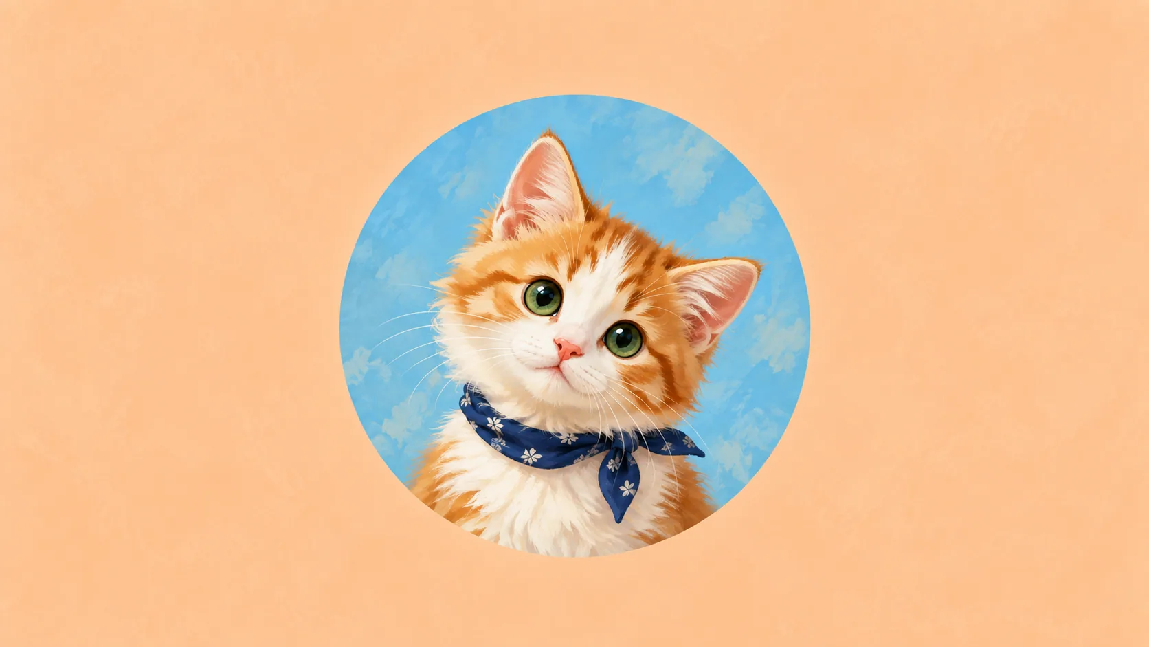
Plain and minimal. A small number of colors leaves room for the facial outline. It is useful when you want the expression and markings to carry the portrait. Look for an intentional transition or shape rather than assuming that an empty background is always stronger.
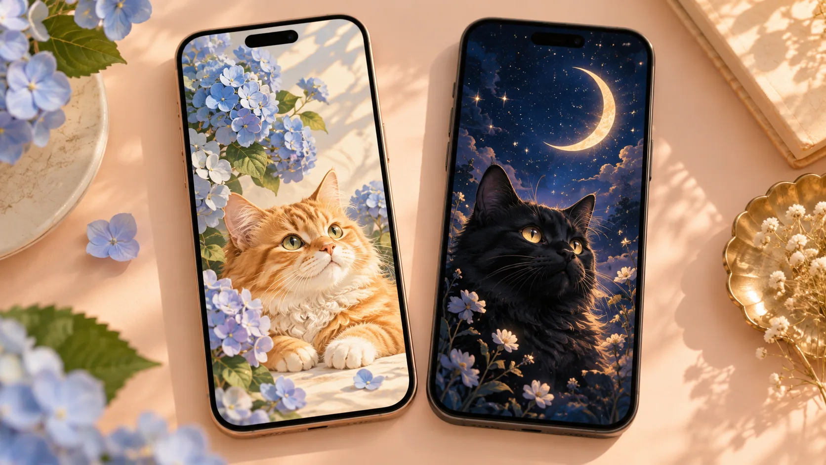
Botanical or outdoors-inspired. Leaves and soft shapes can suggest a place or a season. Check whether a stem appears to grow out of an ear or a bright leaf draws attention away from the eyes. The scene can stay recognizable without putting detailed objects directly behind the face.
Color blocks. Large shapes can add energy without the complexity of a realistic room. Compare their borders with the cat's outline: a strong diagonal through an eye may compete with the expression. A block around the head can act as a visual frame.
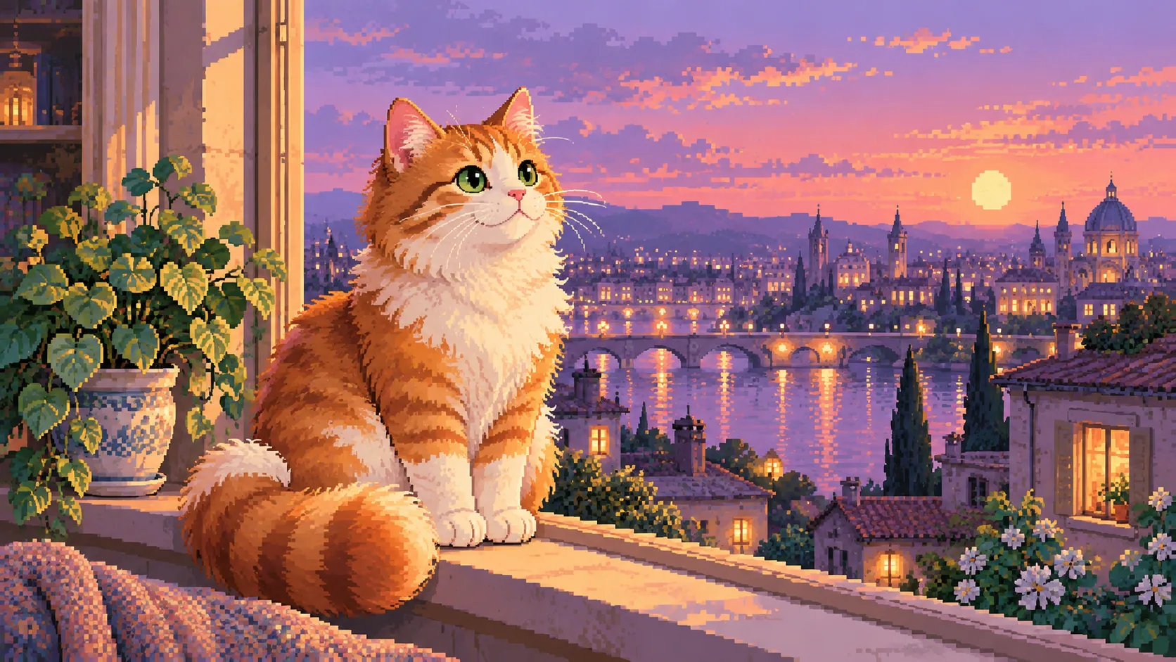
Dark and cinematic. A dramatic setting can suit a playful fictional character. Keep a visible boundary between the cat and the scenery. A striking full-size image may still lose the face when reduced to an avatar.
Make a fair comparison
When editing an image yourself, duplicate the same file and change only the background. Keep the cat's scale, crop and position the same. Compare two or three alternatives at once, then cover the surrounding page so the interface does not influence the choice.
If you generate different styles, the face, lighting and composition may change together. Those results are examples of different complete portraits, not a controlled background experiment. Check the cat's likeness separately before attributing a difference to the background.
For a simple test, view each option in grayscale using an editor's temporary preview. If the head merges into the background, the issue may be brightness contrast rather than the color combination. Return to the color version before deciding; grayscale does not tell you everything about the final image.
Check the image at its intended size
For an avatar, preview a small square and a circle crop. Keep the face away from the corners, and make sure the ears remain visible within the circle. Details that look attractive at full size may become visual noise when reduced.
For wall art, look at the complete composition from farther away. Decide whether the background should relate to the room's palette or create a deliberate contrast. A room mockup suggests an arrangement but does not predict the physical print's color or scale accurately enough to replace measurements.
For a gift, think about the recipient's existing pictures. A quiet neutral setting may be easier to place, while a theatrical scene works best when its humor is something they enjoy.
Use the available style controls honestly
Frameow offers preset styles. It does not provide a general background editor or a free-text prompt box. Compare the complete examples on a style page and use only the controls that creator actually offers.
The minimalist, botanical, color-block and cyber-noir pages offer different visual directions. Their outputs are digital artworks, and any pictured frames or rooms are presentation mockups.
Before saving your favorite, check four things: visible face, readable outline, intentional crop and a background you enjoy at the size you will use. A background earns its place when it helps the portrait feel complete.
Cat portrait tutorials, creative gift ideas, and new styles from the Frameow team.