
Paper for Art Prints: Matte, Glossy and Textured
Compare matte, glossy and textured paper for art prints. Learn what to check for your printer and how paper affects detail, dark colors and reflections.
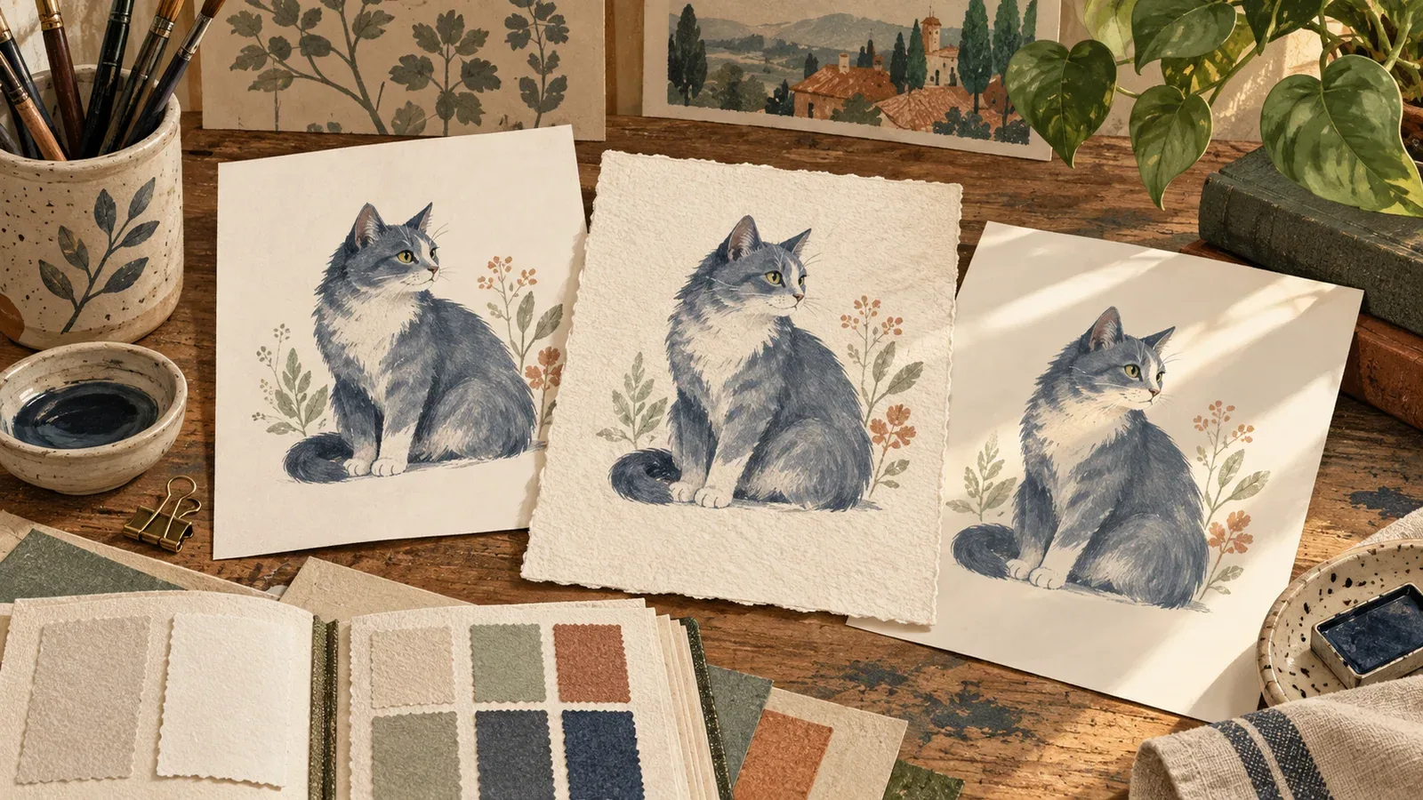
Table of Contents
The best paper for an art print is a paper that works with the printing process and suits the way you will view the image. Start with compatibility, then compare surface, paper tone, detail and reflections. A heavier sheet is not automatically a better print.
Compare the finish in the intended display
| Finish | What to examine | A useful sample check |
|---|---|---|
| Smooth matte | Detail without a strongly reflective surface | Compare dark fur and small facial marks |
| Glossy | Reflections as the viewing angle changes | Hold a sample under the room's lighting |
| Satin or luster | The balance between sheen and surface texture | Compare both straight-on and oblique views |
| Textured art paper | How the surface interacts with marks in the image | Inspect fine whiskers and flat color areas |
These labels describe broad families. Exact papers can differ in coating, texture, tone and printer requirements. Ask for the product name rather than ordering simply “premium paper.”
Read an actual paper specification
For a concrete comparison, Red River Paper's art-paper guide, read September 14, 2026, lists these manufacturer specifications:
| Paper | Listed surface and material | Listed weight and thickness |
|---|---|---|
| Aurora Art White 250 | Semi-smooth, 100% cotton, white tone | 250 gsm; 13.5 mil |
| Polar Matte 230 | Smooth, alpha-cellulose, bright white tone | 230 gsm; 10 mil |
| Palo Duro Etching 315 | Textured matte, 100% cotton, warmer white tone | 315 gsm; 21 mil |
The table describes the manufacturer's products, not our physical test results. It shows why “matte” and “heavy” are insufficient specifications: the papers also differ in texture, base tone and thickness.
Look at the details that matter in your picture
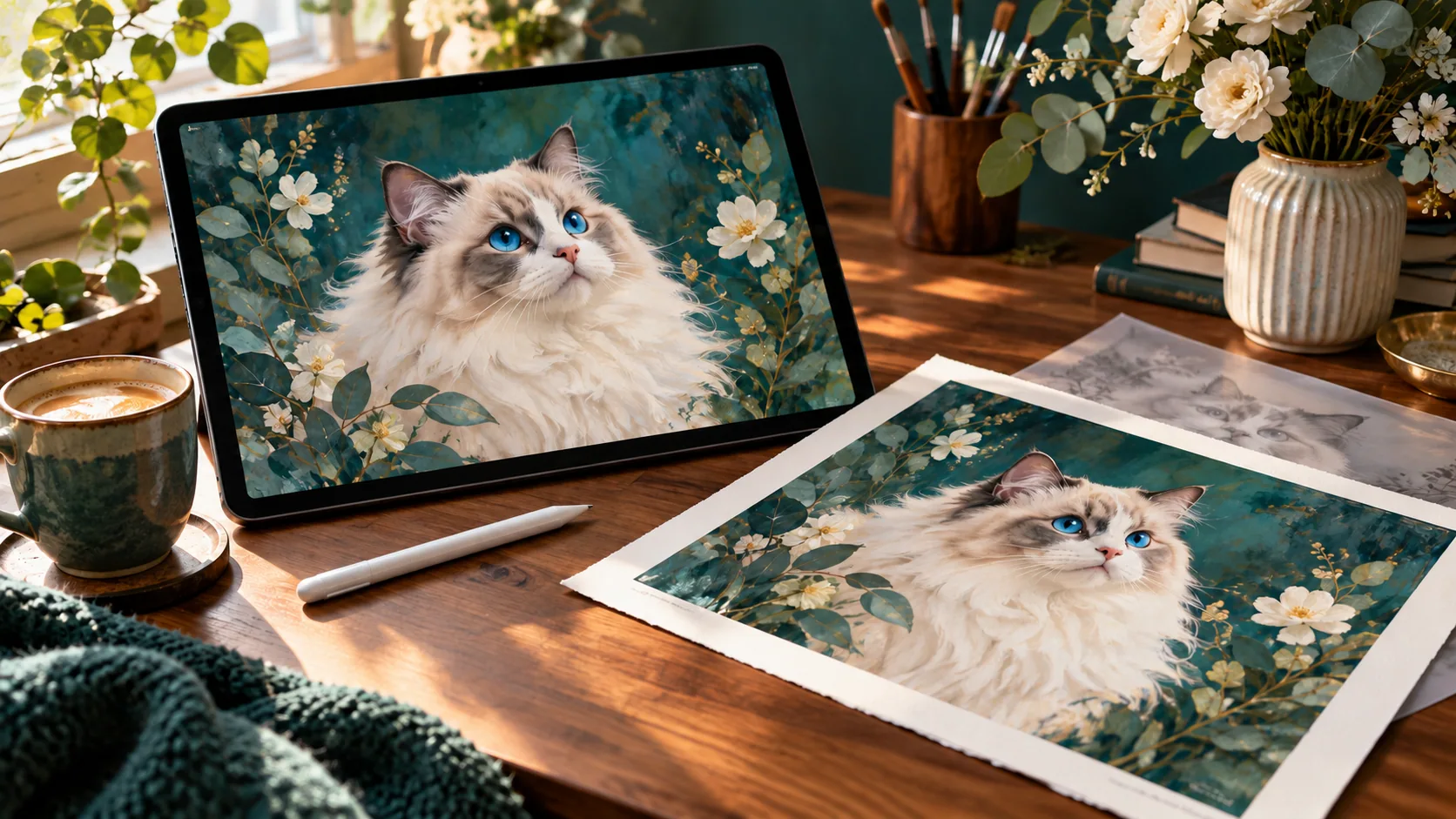
For a cat portrait, mark three areas in a duplicate of the image: the darkest fur, the fine lines around the eyes, and a pale transition in the background. Use those same areas when comparing paper samples.
Check whether dark patches remain distinguishable, whether tiny marks are readable, and whether a texture competes with the image's own painted texture. A smooth photographic portrait and a loose watercolor-style image may lead you to different preferences.
Do not judge paper from an online room mockup. A photograph of a print is affected by its lighting and camera, while your screen introduces another set of variables. Use a physical sample for a decision about glare or tactile texture.
Check printer compatibility before buying sheets
Find the exact printer model and the paper manufacturer's guidance for it. Check the supported media type, thickness, feed path, sheet size and printable side. Inkjet paper should not be treated as a universal choice for every printer process.
Use the recommended media setting and color-management instructions for your combination of printer, ink and paper. If you use a print shop, ask it to choose a supported paper from its own catalog instead of bringing an unfamiliar sheet and assuming it will work.
Paper weight in grams per square meter describes mass per area. It does not tell you the entire thickness, surface, stiffness or expected print behavior. The manufacturer's separate thickness values in the table are a useful reminder to check more than one number.
Make a comparison you can repeat
Use the same image, crop and printed image area for each sample. Keep a record of:
- Paper manufacturer, product and size.
- Printer or print service and ink/process if supplied.
- Media and color settings.
- Image dimensions and any scaling.
- Print date, drying instructions and viewing light.
- Your observations about the face, dark areas and reflections.
Change one variable at a time when possible. If two shops use different papers and printers, you are comparing complete outputs; you cannot attribute every difference to the paper alone.
Choose for this print, then keep the record
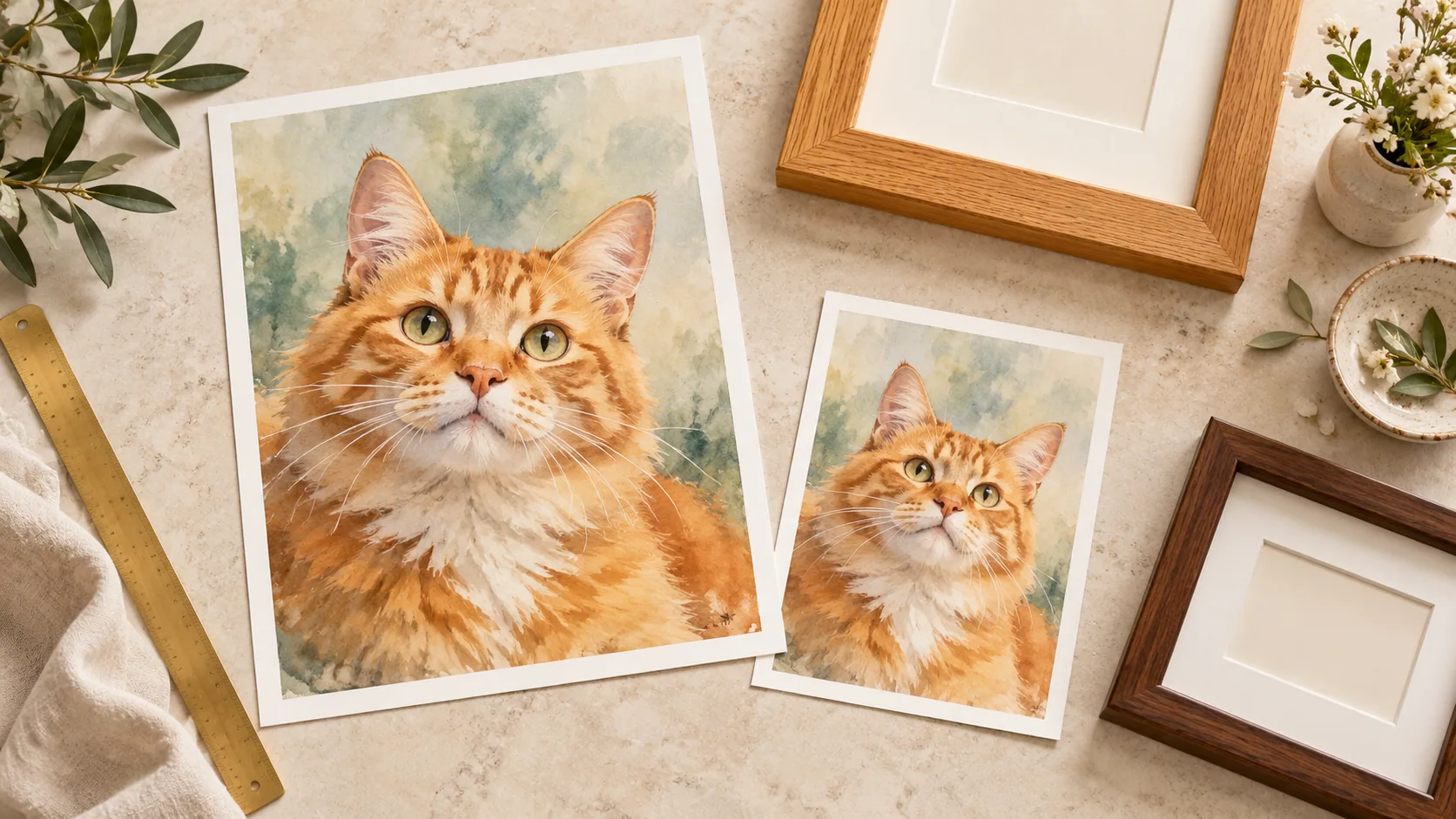
For a small keepsake, start with an affordable sample that preserves the expression and is pleasant to handle. For a prominent wall print, compare it under the actual room light and account for the frame's glazing as well as the paper's surface.
Claims about long-term permanence depend on the ink, paper and display conditions together. Ask for the manufacturer's supporting information rather than assuming that a high GSM or an “archival” label promises a fixed lifespan.
Once you like a sample, save the specification with the digital file. Our printing guide covers the separate questions of pixel dimensions, image area and cropping before you place an order.
Cat portrait tutorials, creative gift ideas, and new styles from the Frameow team.